Packaging Design
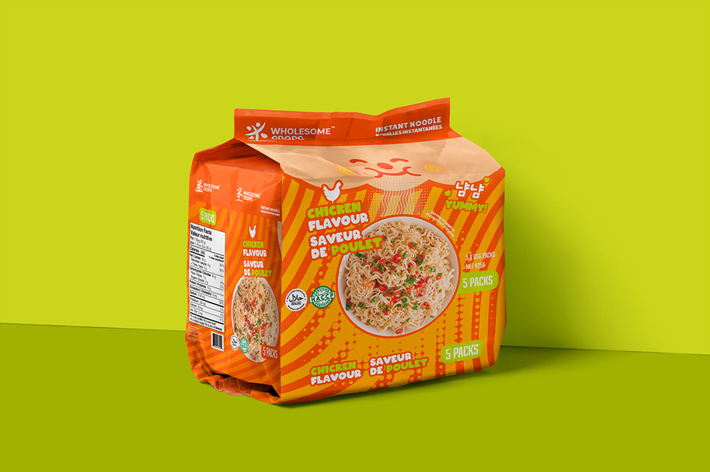
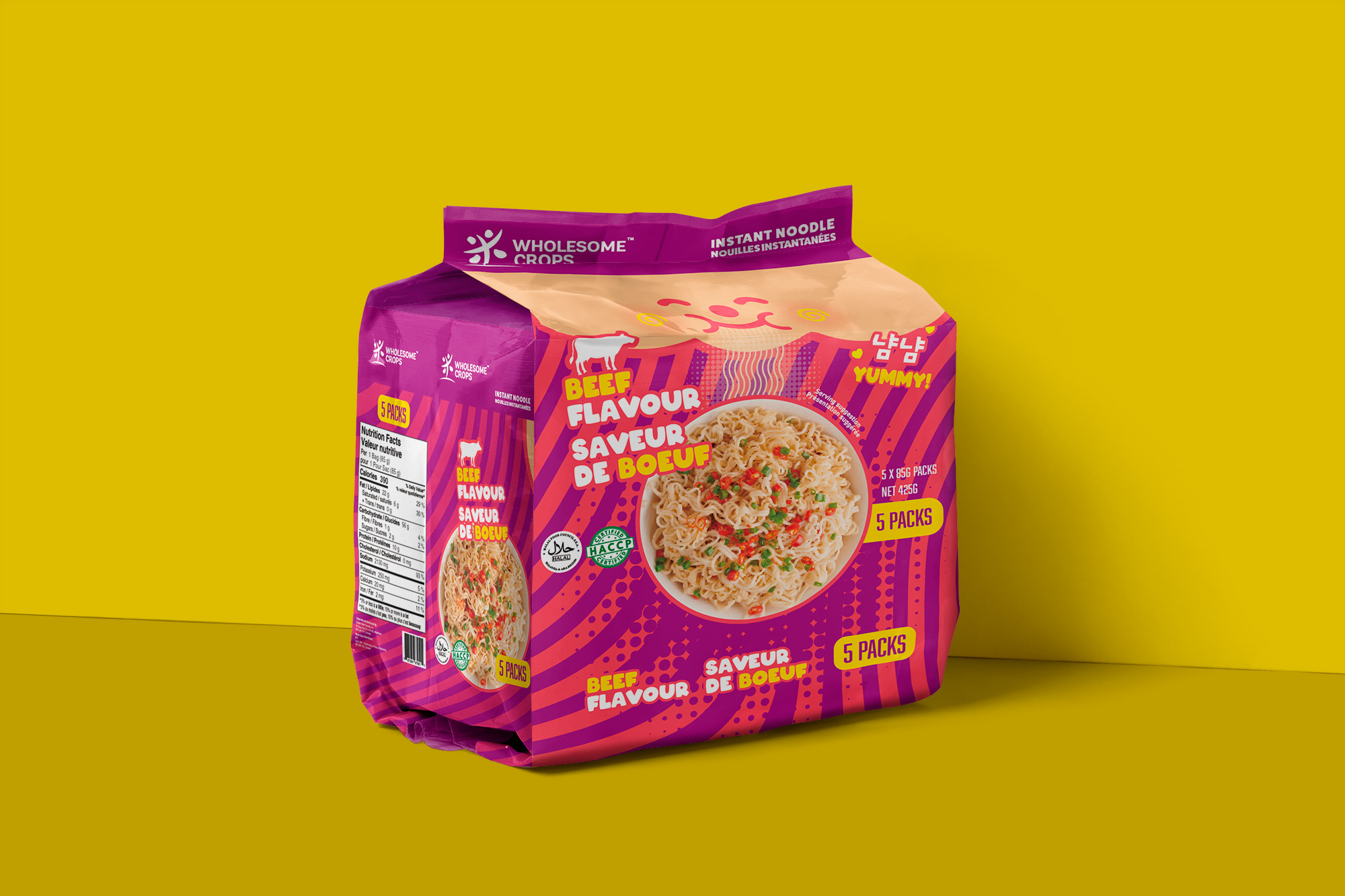
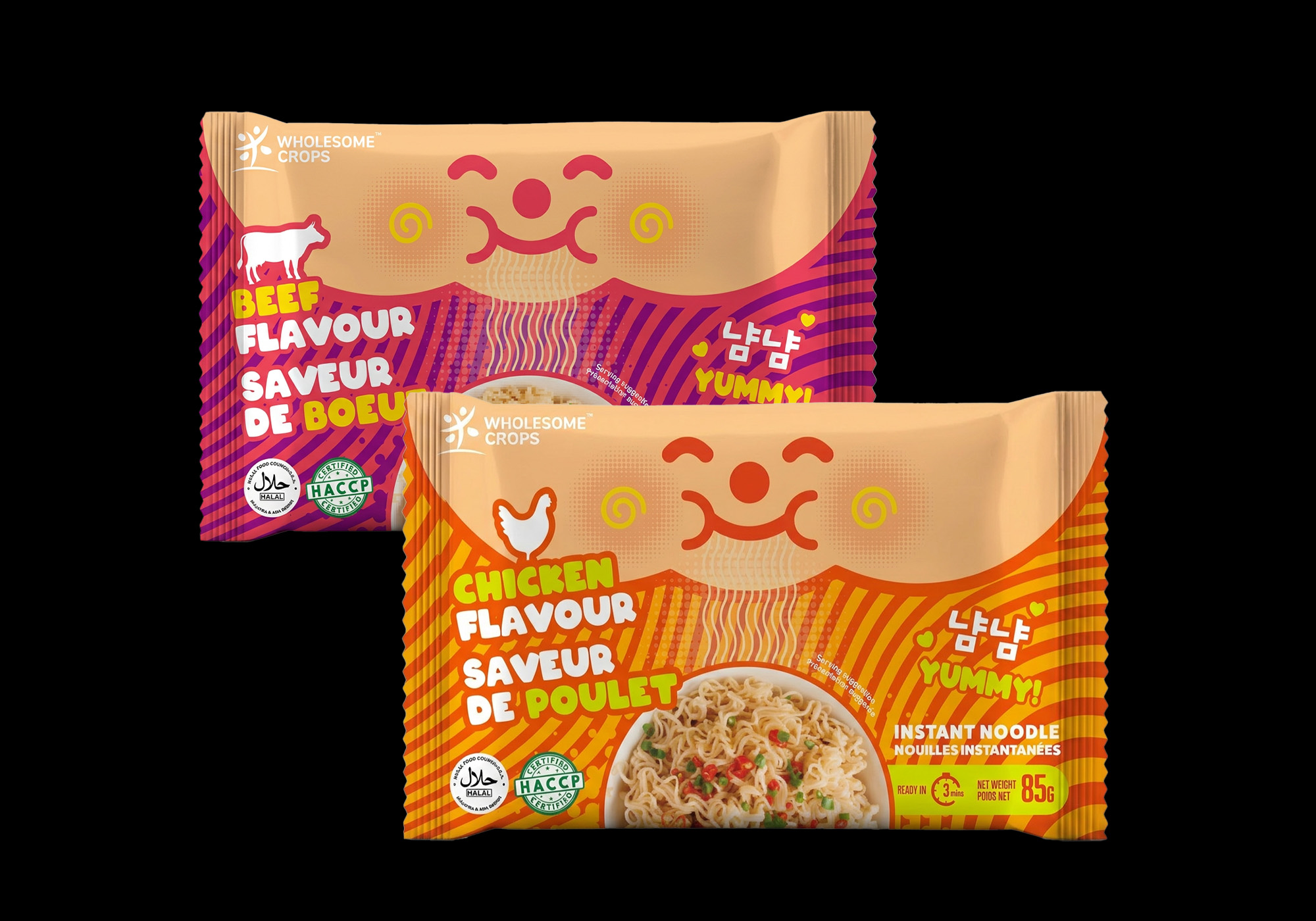
The packaging design for this Toronto-based noodle brand targets younger, budget-conscious shoppers at supermarkets like FreshCo. The concept uses vibrant colours to distinguish flavours—red for beef and yellow for chicken—so customers can quickly identify them on the shelf. A playful, chubby-cheeked character slurping noodles adds humour and personality, creating a fun and memorable brand identity. Combined with bold typography and bright visuals, the design aims to convey a tasty, affordable, and energetic product that appeals to younger audiences. 🍜